Glorious detail in a gothic revival church

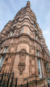
I HAD PASSED it often, but never entered it until recently when I attended a concert within it. I am talking about a church on Holland Road in West London not far from Shepherds Bush, St John the Baptist. This Anglican church is an exceptional example of gothic revival style. Designed by James Brooks (1825-1901) with John Standen Adkins (an assistant of Brooks), it was constructed between 1872 and 1910.

Although the façade facing Holland Road is not exceptional, the church’s interior is highly breathtakingly decorative. Unlike mediaeval churches, which took centuries to complete, St John the Baptist was constructed in much less time. Yet, its decorative details, which imitate what is best in many older churches, rival those found within the old ones. The workmanship and fine details in St John’s remind one of the best productions of craftsmen, who flourished many centuries earlier. However, unlike the earlier churches, which inspired the designers of St John’s, the interior of the church on Holland Road looks too good to be true. Completed in a relatively short period, the variety that adds to the charm of gothic churches built in earlier times and more slowly is lacking in St John’s and other fine examples of late Victorian gothic revival buildings. What we see at St John’s is the realisation of the architects’ concept of an ideal ‘mediaeval’ church. What was achieved at St John’s is probably something like the results early creators of (mediaeval) churches hoped to create, but never lived long enough to see fully realised.

The attention to detail in the better gothic revival churches, such as St John’s, is marvellous. The result is an ensemble of decorative features rich in meticulously executed intricate details. While I was listening to the concert in St John’s, my eyes took in the details of the church, and I began thinking it was amazing that the elaborate attention to fiddly ornate minutiae was carried out only a few years before architectural trends turned through 180 degrees from excessively decorative to the greater simplicity of much 20th century architecture.

A railway station far below the surface at Hampstead

HAMPSTEAD UNDERGROUND STATION, which was designed by Leslie W Green (1875-1908), was opened for passengers in June 1907. Green was responsible for the use of blood red, glazed terracotta tiling on many of London’s Underground stations. The station facades and interiors which he designed, including those at Hampstead, feature many aspects of the British Art Nouveau style. Examples of this style can be seen on Hampstead’s facade, interior tiling, and the ticket office counters.

While I was researching my latest book, “Golders Green & Hampstead Garden Suburb: Visions of Arcadia” (available from Amazon), I came across an interesting diagram in a book by FC Howkins (published in 1923). It shows how the Northern Line tracks rise gradually from several feet below sea level at Embankment (formerly Charing Cross) station to 192 feet above sea level at Hampstead station. However, Hampstead station’s ticket office is about 360 feet above sea level, which is 168 feet above the tracks and platforms (Wikipedia stated that the platforms are 192 feet below the surface). High speed lifts convey passengers between the platform entrances and the ticket office. Originally, these were slow lifts which were entered though brown sliding wooden doors with Art Nouveau inspired cut-outs for ventilation purposes. These old lifts still existed when I was at school in the 1960s, but the newer high-speed lifts with metal concertina doors were the main method of moving between the surface and the trains. Currently, newer lifts have replaced those which were in use between the 1960s (or maybe earlier) and 2014.

If you have a long wait before your train arrives at Hampstead, it is worth wandering to the end of the platform, where you will find the station’s original name, ‘Heath Street’, still on the wall. Today, I disembarked at Warren Street, and noticed that its old name ‘Euston Road’, is still clearly visible at the end of the southbound platform next to its exit.

By 1907, the Northern Line had been extended northward to Golders Green, whose station was opened for passenger use in 1907. It is a long journey between Hampstead and Golders Green stations. An intermediate station near the Bull and Bush pub (on North End Road) was planned. Although the platforms were constructed, they have never been used by passengers, and there is only a small hut on the surface (on Hampstead Way), which contains the entrance to shafts leading down them. Opposition by the founders of Hampstead Garden Suburb and later its residents ensured that the planned ‘North End’ station was never completed.

The Art Nouveau ticket counters at Hampstead station are no longer in use, but they have been beautifully preserved. In each of them, there are information panels detailing the aspects of the station’s history. Other decorative features have been maintained but much of the space in the ticket hall is occupied by the automatic ticket-checking entrance and exit portals. Perched at the top of the High Street, at the point where it meets Heath Street, Hampstead station is an important meeting point and a hard to miss landmark.

Two in one at South Kensington

SOUTH KENSINGTON STATION has two street entrances connected by an arcade with a glazed roof. Its subsurface ticket office and foyer gives access to three of London’s Underground Lines: Circle, District, and Piccadilly. But this has not always been the case. People standing outside the southern entrance to the arcade will notice that to its right there is a building faced with the blood red glazed terracotta tiles typical of many London Underground stations. Above the façade are the words “South Kensington Station”, but there is no public entrance to this building.

The arcade used to be the entrance to the station at which passengers could embark and disembark from trains operating on the District and Circle lines, which were part of the Metropolitan Railway. This station was opened in 1868. In 1906, a station on the Great Northern, Piccadilly and Brompton Railway (now the Piccadilly line) was opened at South Kensington. Its platforms are far deeper beneath the surface than those of the District and Circle lines. Lifts inside the building with the red façade carried passengers to and from the Piccadilly line platforms. This building was then the entrance to the Piccadilly Line station, which was separate from that (with the arcade) which led to the shallower subsurface Circle and District platforms.

In the early years of the 1970s, the lifts to the Piccadilly Line were replaced by escalators. Access to these was made from the concourse that serves the District and Circle line platforms, and then the entrance via the building with the blood red façade was taken out of use. So, what had been two stations became one.

You can read much more about South Kensington in my book “Beyond Marylebone and Mayfair: Exploring West London” (see: https://www.amazon.co.uk/BEYOND-MARYLEBONE-MAYFAIR-EXPLORING-LONDON/dp/B0B7CR679W/)

A mansion in Marylebone

A HIGHLY DECORATIVE BLOCK of flats stands on the southeast corner of the intersection of Wimpole and New Cavendish Streets. Bearing the date 1892, one of its large bricks was laid by Mary Mason Lithgow.

Mary was the mother of the person who commissioned the building, the lawyer and property developer Samuel Lithgow (1860-1937). Samuel was born in Marylebone and after qualifying as a solicitor, he practised at 42 Wimpole Street. Politically inclined, he represented the West St Pancras ward of the London County Council between 1910 and 1913. A philanthropist, he founded the Stanhope Institute for Men in 1891. In addition, he was a governor of the North West London Polytechnic (founded 1896).

Wimpole House was designed by Charles Worley (1853-1906) in the so-called Belgian Renaissance Style. It is a very florid addition to an area filled with buildings displaying a wide variety of decorative flourishes

Faces of India for Queen Victoria

THE CORRIDORS LEADING to the spectacular Durbar Room in Osborne House on the Isle of Wight are lined with portraits of people born in pre-independence India, either painted or photographed during the 19th century. Most of these images depict members of the Indian aristocracy (e.g., rulers of Princely States). A few depict less exalted persons, such as craftsmen and the designer of the Durbar Room.

Maharajah Duleep Singh (1838-1893), who surrendered the Koh-i-Noor diamond to Queen Victoria, is portrayed in a few pictures, notably one by the famous German artist Franz Xaver Winterhalter (1805-1873). Many other paintings were created by the Austrian painter Rudolf Swoboda (1859-1914). Queen Victoria liked his painting style and commissioned him to create more than 40 portraits of Indian people. In 1886, the queen paid for him to travel to India, and gave him £300 in travelling expenses. Her instructions to the young artist were:

“The Sketches Her Majesty wishes to have – are of the various types of the different nationalities. They should consist of heads of the same size as those already done for The Queen, and also small full lengths, as well as sketches of landscapes, buildings, and other scenes. Her Majesty does not want any large pictures done at first, but thinks that perhaps you could bring away material for making them should they eventually be wished for.” (www.rct.uk/collection/403755/gulzar).

Many of these can be seen hanging in Osborne House. Amongst his many Indian portraits, there is at least one painted not in India but in England. Queen Victoria had several servants, who were born in British India and the Princely States associated with it. The best known of these ‘imported’ servants was her favourite Mohammed Abdul Karim (1863-1909), her ‘munshi’ (teacher), who helped her study Hindustani, which she learned to write competently in the Urdu script. Amongst Swoboda’s paintings of Indians hanging in Osborne House, there is one of a non-Indian, a lady from Cyprus, and another, a Cape Malay woman from  Cape Town (South Africa). Why they are there, I have not yet found out, but maybe Swoboda spotted them at the Colonial Exhibition held in London in 1886.

Not all the portraits of Indians are painted. Some of them are hand-coloured photographs. A few of these photos are signed by their creators, one of which was the photographic studio of Gobind Ram and Oodey Ram in Jaipur. Along with a studio in Calcutta the Ram brothers were pioneers in photography in 19th century India. One source (www.indiatoday.in/lifestyle/whats-hot/story/tryst-with-colonial-india-205124-2014-08-22) stated:

“Apparently, studio photography was practised by many Maharajas as a means of leisure, mostly using their courtesans as subjects. The Ravi Varma Studios of Calcutta and Gobind Ram-Oodey Ram Studio in Jaipur are just two examples.”

As can be seen at Osborne, these photographers also made portraits of the maharajahs and their families.

Although Queen Victoria loved Osborne House, I cannot see its appeal apart from the wonderful Durbar Room. For me, seeing this lavishly decorated hall and the collection portraits of the Indian people are the main delights of this otherwise rather gloomy residence.

A cavity in a Cambridge College

DURING A RECENT visit to Cambridge, I noticed a hemispherical cavity into which an electric doorbell push button had been fitted. it was at Peterhouse College. I posted a picture of it on Facebook and received the following range of replies and reactions to it. Here they are in the order they appeared:

“My guess is there used to be a handle in there to operate a mechanical bell. There would have been a brass escutcheon plate, dished like the hole to accommodate the clenched hand grasping the handle. There seems to be a void behind the current bell button, the linkage probably went through there. You can see a shadow either side, rather like a bow tie, where the escutcheon was.”

“.. pull a cord or chain?”

“That will summon David Jason.”

“A square bell in a round hole”

“This was my husband’s college (about 45 years ago). I’m sure he’ll remember this well.”

“Yes, but I would expect the bar or chain operating the original to come straight out of the back of the cone, and there’s no hint of that.”

The range of comments was from frivolous to informative. I find that posting interesting items on Facebook often elicits useful information about them. By judicious posting and cross-checking information provided, Facebook can become a useful research tool.

Seen in the park

Black and white stripes

Adorn their long furry tails

Two lemurs in a cage

These two lemurs live in a cage in Golders Hill Park in northwest London. You can discover more about Golders Green and its wonderful park in my new book: https://www.amazon.co.uk/gp/product/B0BHG873FB/

DEFACED TO DEFY: an exciting exhibition in Cambridge

POLITICAL PROTEST AND CONFLICT can be expressed in a wide variety of ways. Defacement of commonplace items is one of these. It forms the basis of a temporary exhibition, “Defaced!”, being held at the Fitzwilliam Museum in Cambridge (Cambridgeshire) until the 8th of January 2023.

Many of the exhibits on display are banknotes that have been defaced or altered in design to express a political message or protest.  One example of this is a five-dollar US banknote with the words “All Lives Can’t Matter until Black Lives Matter” embossed on its portrait of Abraham Lincoln. Another is a five hundred Indian rupee note with a coloured picture of an endangered rare bird printed over it. Yet another banknote is designed to look like a British £20 note at first sight, but it soon becomes apparent that it is not what it seems: it has been modified to include a portrait of ex-Prime Minister Boris Johnson and the words “The ruling class. We own you.” It also includes the words “We were born to lead, you were born to follow.” Other banknotes have been redesigned so that they appear to be valueless: e.g. zero Japanese Yen and zero US Dollars. The diversity of altered banknotes and parodies of actual banknotes on display is staggering.

Occasionally banknotes lose their value during periods of hyperinflation. The exhibition includes several examples of objects, such as wallets, made using trashed valueless notes. Particularly striking is a life-size sculpture of a hand grenade made using shredded PRC ten Yuan banknotes.

There are also many coins on show. They have all been altered to express protest and/or political sentiments. One dramatic example of this is a coin issued in France during the reign of Napoleon III. This was altered by carefully cutting around and removing the portrait of Napoleon III from the coin, leaving the rest of the coin intact. There are several coins and medals on display that depict political events such as the American Revolution and the Peterloo Massacre. A few coins relate to the unrest in Northern Ireland. One of them is a 1970 Republic of Ireland fifty pence coin with the words “Ulster is British” stamped on it.

The show at the Fitzwilliam does not confine itself to the defacement and parody of currency for political and protest purposes. It also includes currency either modified or specially created for special purposes. Simple examples of these are overprinting of low value notes during hyperinflation and modification of currency for use by the military or in POW camps. There are also coins, notes, and certificates created for specific purposes, for example for use in the Siege of Mafeking and for use by Boer prisoners imprisoned by the British in India.

Although most of the exhibits are related to currency (coins and notes), one room is dedicated to a spectacular sculptural exhibit, an installation called “Big Bang 2. Debt in transit”. A video is projected onto a wall. It shows a Ford Transit van being blown up by explosives. As it flies into pieces, bits of paper all marked with the word ‘debt’ float down like snowflakes. The film is projected in a room in which the fragments of the van are suspended from the ceiling so that the viewer appears to be seeing a still from the video but in three dimensions. The installation, which is a protest on the exorbitant interest on payday loans, makes a very powerful visual impact. (SEE my video of this posted on YouTube: https://youtu.be/7MgdDTfBivw)

An uninteresting artist in a Hertfordshire church

SAWBRIDGEWORTH IS AN ATTRACTIVE small town with many picturesque old buildings and a parish church, St Mary’s, whose construction began in the 13th century. It is an unusual edifice, being about as wide as its length, rather than longer than its width as is the case for most English churches. It contains a fine selection of elaborate funerary sculptures.

The most impressive funerary monument is the memorial to John Leventhorpe and his wife Joan, who died in 1625 and 1627 respectively. Within a multi-coloured marble frame, both of the deceased are depicted reclining on their left sides with their heads propped up by their left hands. John holds a sword in his right hand and Joan a small book in hers, Beneath the two statues, the couple’s six sons (one of whom, Arthur, died as a baby) and eight daughters are depicted in bas-relief, all kneeling in prayer. Baby Arthur is also present on the memorial but has been sculpted much smaller than his brothers. The whole sculptural ensemble is magnificent, and if you had time to see only one thing in Sawbridgeworth, this should not be missed.

High on the wall facing the Leventhorpe memorial, there is a smaller one, commemorating Jeremiah Milles (died 1797) and his wife Rose, who died in 1835. It is typical of early 19th century memorial art. It shows a female mourner in Hellenic dress kneeling in front of a sarcophagus. It was sculpted by John Termouth (1795-1849) of Pimlico (London).

The sculptor of the Leventhorpe memorial has been forgotten, but Termouth, who sculpted the Milles memorial, has not been consigned to obscurity. A notice in St Mary’s revealed that Termouth was:

“… an uninteresting artist whose symbolism was always obvious, hackneyed, and uninspired.”