WORKS BY COLOMBIAN artist Beatriz Gonzalez (1932-2026) are being exhibited at London’s Barbican art gallery until 10 May 2026. She began studying architecture in the 1950s, but dropped out. Later, she studied fine arts at the University of Los Andes in Bogota, graduating in 1962.
Over the years, Gonzalez produced a wide variety of works, and throughout her life she believed that (to quote her): “Art says things that history cannot”, and what one can see in the exhibition confirms this. She lived through troubled times in Colombia, and this is reflected in many of her artworks. She has been described as a ‘pop artist’ possibly because many of her works were inspired by things she saw in magazines, newspapers, posters, and other media aimed at the public. However, she discounted this description, as can be seen by this answer to the question “Did you ever consider yourself (now or in the past) a pop artist?” during an interview she gave at the Tate Gallery in 2015:
“No, I considered my work a provincial type of painting. I’ve always considered myself more of a painter and within this remit I painted the joy of the underdeveloped. For me the type of art that I was doing could only circulate internationally as a curiosity. Mine was a provincial type of art without horizons, confronting the everyday: art is international.”
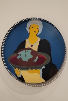
I will not attempt to discuss all the works on display at the Barbican, but will confine myself to her paintings on items of furniture, which she commenced in the 1970s. These beautifully executed creations are often quite witty. “The Last Supper” was one of the first of these pieces of furniture repurposed as a work of art. It consists of a fine table on the top of which the artist has painted a simplified version of a renaissance depiction of the Last Supper. And on a wooden coat stand, the mirror has been painted over with Gonzalez’s simplified version of the famous Mona Lisa painting. Another example is a straw basket with a ribbon on its handle. On the inside of the base of this everyday object she has painted a picture of three puppies resting on a floor. There is also a metal cot whose base is painted with a picture of a sleeping child. In the show, there are some televisions with paintings of people covering their screens. By now, you must be getting the idea of this aspect of Gonzalez’s art. My favourite example of this re-use of household items as places to paint pictures is a circular tray on which the artist has depicted Salome carrying the severed head of St John the Baptist on a circular tray.
Apart from the painted furniture and domestic items, the exhibition has a series of sections that show examples of Gonzalez’s art at the various stages in her artistic career. As is often the case at the Barbican art gallery, the artworks are beautifully displayed and well labelled.