AT THE EXPRESSIONIST exhibition, currently showing in London’s Tate Modern until the 20th of October 2024, I was suddenly reminded of something that I did in the last three months of 1963. During those months, my father was a visiting academic in the economics department of the University of Chicago. I spent that period as a pupil in the University of Chicago’s Laboratory School. It was in that time that President John F Kennedy was assassinated.
Once a week, we had a lesson during which the teacher played us a recording of classical music – some Beethoven, for example. Each of us students were given a large sheet of white paper and some coloured crayons. While the music was playing, we could draw whatever the music inspired us to do. I cannot recall what I drew, but I do remember these lessons.
Kandinsky and his siblings
Today, the 15th of July 2024, we visited the Expressionist exhibition at the Tate Modern. In one small room, there was music by Arnold Schoenberg playing in the background. There was also a photograph (taken about 1888) of the artist Wassily Kandinsky (1866-1944) playing chamber music with his two siblings. Opposite the photograph, I saw a framed painting created by Wassily Kandinsky in 1911. It is called “Impression III (Concert)”. He painted it after hearing a concert of music by Arnold Schoenberg. This painting was his response to the music.
It was seeing this painting by Kandinsky that reminded me of our music-inspired art sessions in Chicago back in 1963.
WHENEVER I VISITED my in-laws in India, I used to admire the painting by the Bengali artist Jamini Roy (1887-1972), which used to hang in their flat. His style of painting was both modern (20th century) and at the same time almost folkloric. When our friend Bob Annibale posted on Facebook about an exhibition at the Brunei Gallery (in London’s Bloomsbury) that included Roy’s works, we could not resist visiting it, and we were glad we viewed it.
The exhibition, which continues until the 22nd of June 2024, not only contains a good selection of Roy’s works, but also others by Bengali artists working mainly between the late 19th century and the 1950s. Apart from works by Roy’s contemporaries including various members of the Tagore family, Hemendranath Mazumdar, Nandalal Bose, and Qamrul Hassan, there were also paintings by lesser-known or unknown artists who painted in the traditional late 19th century Bengali (Kalighat) style, rather than in experimental styles of the 20th century.
The emergence of modern Indian painting was a consequence of the establishment of The Government College of Art in Calcutta (in 1854). As the website of the Brunei Gallery explained, it was:
“… established by a benevolent government for the purpose of revealing to the Indians the superiority of European art.”
In the late 19th century, Indian artists working in the college began questioning the validity of Indians painting in the alien Western European fashion that was being taught them. The gallery’s website continued:
“Academic art, introduced by the British Raj, was challenged by the nationalist art movement, the Bengal School of painting, led by Abanindranath Tagore (1871-1951) and his disciples who dominated the art scene in the first decades of the twentieth century.”
It is works by these artists, who used their creations as part of their expressions of desire to see India free of British rule, that form the greater part of the show at the Brunei.
Several things particularly interested me whilst viewing the excellently curated and displayed exhibition. One was three paintings by Jamini Roy that illustrate Christian themes (e.g., the Crucifixion, the Last Supper, and the Flight to Egypt). I had not before seen any of Roy’s paintings depicting Christian stories. Another exciting discovery for me were a selection of paintings by Sunayani Devi (1875-1962), who was the sister of the artists Abanindranath Tagore and Gaganendranath Tagore, some of whose pictures are also hung in the show. These 3 siblings had a famous uncle, Rabindranath Tagore, some of whose paintings were also on show. At the exhibition, there were portraits of Rabindranath Tagore by each of his above-mentioned relatives, and one by Jamini Roy.
Yet another artist on show, whom I had never encountered, is Qamrul Hassan (1921-1988), who was born later than the other artists. Born in Calcutta before independence and the Bangladesh War (1971), he died in what is now Bangladesh. He studied at The Government College of Art in Calcutta in the late 1930s, and afterwards became involved with left wing political activities as well as his art. Later, he was active in the struggle for East Pakistan (now Bangladesh) to become independent of what was then West Pakistan. Beneath one of his creations at the Brunei, there is a quotation by Qamrul about his style of painting:
“… where Jamini Roy ends , I begin …”
And this is so easy to see in the excellent exhibition at the Brunei Gallery
I have told you what stood out for me, but although I have highlighted a few things, the rest of the exhibits are wonderful, and not to be ‘sniffed at’. After seeing the show, I thought that never before had I seen such a fine and large collection of paintings by the liberated artists either here in the UK or in India. The curators of this show deserve hearty congratulations.
IT DISAPPOINTS ME when I sleep without being aware of dreaming. Even nightmares are better than no dreams at all. What I enjoy about dreaming is that what I perceive in my dreams is on the one hand so realistic – lifelike and credible, and on the other hand simultaneously so completely unrealistic. The art of cinema can achieve the same ambiguity between realism and fantasy, which is why I enjoy watching films. Until the 12th of May 2024, there is an excellent exhibition at London’s Whitechapel Gallery, which explores what I enjoy about films and dreams. Called “Dreams Have No Titles”, it displays the multi-media creations of the Franco-Algerian artist Zineb Sedira, who was born in 1963 – the first year that Algeria was independent of the French, who had colonised it since 1830.
The exhibition, which was first shown in the French pavilion at the Venice Biennale of 2022, consists of a series of film sets. On one of the film sets, an elegantly dressed couple of actors perform ballroom dancing ( https://youtube.com/shorts/kUrD3aJP9s0?si=zez0VWoRqWmJMy4l ) for a few minutes at various times of the day. Each film set reproduces a scene from one of several films made in the 1960s – each one referencing events that took place during the period when Algeria was fighting for its independence. Within the film sets there are video sequences about that period, and about the artist and her life. Born in France, she came to the UK in 1986. One of the exhibits is a wonderful film with the same title as the exhibition. In it she explores film, its creators, its actors, imagination, dreams, and her artistic approach. Each of the film’s 24 minutes is wonderful. The film and other video works in the exhibition are in harmony with what I find so similar between experiencing dreams and watching cinematic films. I came away from the exhibition feeling elated and full of admiration for Zineb and her artistic work.
JULIA MARGARET CAMERON (1815-1879) was born in Kolkata (Calcutta) and died in Sri Lanka. When her husband retired from the Indian civil service, she and her family bought a house on the Isle of Wight, close to that of her friend, the poet Alfred Lord Tennyson. From an early age, when she met the astronomer and chemist Sir John Herschel in Cape Town, she developed an interest in the relatively young technique of photography. It was only in 1863 when she was residing on the Isle of Wight that she was given her first camera. This was the start of her remarkable career as a photographer. Unlike many other photographers during the Victorian era, Julia was not interested in producing exact images of her subjects in her photographs. Instead, she experimented with lighting, focus, development, and printing, to produce photographic images that were artistic rather than accurate representations of reality. Her subjects included many of the cultural giants of mid to late Victorian Britain. Also, she loved to pose her subjects, dressed in imaginative fancy dress costumes, in intricately contrived tableaux before capturing their image on photographic plates.
Until the 16th of June 2024, there is a temporary exhibition of photographs by Cameron at London’s National Portrait Gallery. Many of Julia’s photographs are on display alongside those of another woman photographer, Francesca Woodman (1958-1981). Although Woodman’s photographs are of a high quality artistically, seeing them alongside those of Julia Margaret Cameron added little to my enjoyment of the exhibition. However, this show does give impressive exposure to Cameron’s pioneering work in using photography as an art form rather than as a medium for recording likenesses. As exhibitions go, I did not feel that this one is a sparkling example of curating. However, I am pleased that I went because I have read a great deal about the life and times Julia Margaret Cameron, and have also published a short book about her, which is available on Amazon:
SEVERAL OF THE GALLERIES within London’s Wallace Collection in London’s Manchester Square, have an overwhelming number of paintings crowded together on their walls. One of these galleries contains several paintings by Richard Parkes Bonington (1802-1828), which I doubt I would have focussed on had I not just seen a small temporary exhibition in a room on the ground floor. The exhibition is called “Turner and Bonington: Watercolours from the Wallace Collection”, and is on until the 12th of May 2024. It contains 10 watercolours (of landscapes) held by the Wallace Collection – four by JMW Turner (1775-1851) and the rest by his short-lived contemporary Bonington. Each of the watercolours is delightful and well-executed. Bonington’s watercolours are delicately crafted, but less adventurous than those of Turner. Because they are so sensitive to damage by light, these watercolours are rarely displayed. The last time they were exhibited was 17 years ago.
Watercolour by Bonington
Now, I had heard of Turner and have seen many of his works, but today (the 29th of March 2024) was the first time I became aware of Bonington. He was born near Nottingham and by the age of 11 was exhibiting watercolours at the Liverpool Academy. In 1817, he and his family moved to Calais (France), where his father set up a business. From there they moved to Paris in 1818. During his time in France, Bonington learned painting from French artists and soon became a friend of the French artist Eugene Delacroix. In 1820, he became a student at the École des Beaux-Arts in Paris. Some of his oil paintings were displayed in the Paris Salon of 1822, and elsewhere. By 1825, he had developed a method of mixing gouache with watercolour, which produced an effect close to what could be achieved with oil paints. After making trips to various parts of France, northern Italy, Venice, and London, he developed tuberculosis. He died in London, where his parents had sent him for treatment. In 1861, many years after Bonington died, Delacroix wrote in a letter (quoted in a Wikipedia article):
“To my mind, one can find in other modern artists qualities of strength and of precision in rendering that are superior to those in Bonington’s pictures, but no one in this modern school, and perhaps even before, has possessed that lightness of touch which, especially in watercolours, makes his works a type of diamond which flatters and ravishes the eye, independently of any subject and any imitation.”
I wish I could have thought of those words, which chime with what I thought after seeing Bonington’s watercolours and some of his many oil paintings now hanging in the Wallace Collection – a London address that no art lover should miss visiting.
PHOTOGRAPHY HAS LONG been an artistic medium for expressing protest. This is well exemplified by photographic images on display at the excellent “Women in Revolt” exhibition, which is on at London’s Tate Britain until the 7th of April 2024, and is well worth seeing. Running concurrently with this. is an exhibition at the South London Gallery (in Peckham) – “Acts of resistance: photography, feminisms and the art of protest”, which is on until the 9th of June 2024.
As its title suggests, the show at Peckham consists mainly of exhibits that make use of photography. There are also several digital items. The subject matter deals with matters that concern feminists (and ought to concern everyone) including rape, abortion, genital mutilation, other forms of violence against women, and so on. Unlike the exhibition at Tate Britain, which deals mainly with feminist activities in Britain during the 1960s to 1980s, this show was to coin a phrase ‘art sans frontières”, and bang up to date. The exhibition has as its inspiration the words that the artist Barbara Kruger used in 1989:
“Your body is a battleground”.
Incidentally, there is an exciting exhibition of Kruger’s work at the Serpentine South Gallery (in Kensington Gardens) until the 17th of March.
The exhibition at Peckham (to quote the gallery’s website):
“… explores feminism and activism from an international and contemporary perspective. Looking at different approaches to feminism from the past 10 years, the show highlights shared concerns including intersectionality, transnational solidarity, and the use of social media and digital technology as a tool for change.”
It includes works by at least 20 artists, some of them working as collaborators. Their creations are displayed well both in the gallery and its annexe nearby in a disused fire station. Put simply, the works on display at Peckham have a far more visceral impact than those being shown at Tate Britain, which in many cases appeal more to the brain than to the heart. Even if you ignore the messaging conveyed by the artists in the works at Peckham – and this is not easy to do – their visual impact is magnificent. They are works of art as well as being tools of protest. This is an exhibition well worth making the trek out to Peckham!
HUMOUR, IMAGINATION, PLAYFULNESS, wit, social criticism, and creativity – these are all words that can be applied to the works of the artist Peter Blake, which are on show in a superb exhibition at the Waddington Custot gallery in London’s Cork Street until the 13th of April 2024.
Blake was born in 1932 in Dartford (Kent). He studied art at Gravesend Technical College, and then at the Royal College of Art in Kensington. He is a leading British exponent of Pop Art, which, according to Wikipedia:
“… is an art movement that emerged in the United Kingdom and the United States during the mid- to late-1950s.The movement presented a challenge to traditions of fine art by including imagery from popular and mass culture, such as advertising, comic books and mundane mass-produced objects. One of its aims is to use images of popular culture in art, emphasizing the banal or kitschy elements of any culture, most often through the use of irony.”
One of Blake’s most familiar works is the album sleeve for the Beatle’s LP “Sgt. Pepper’s Lonely Hearts Club Band”, which he designed along with Jann Haworth, his wife between 1963 and 1979. I wonder how many Beatle’s fans know that Blake was involved with making the image on this.
The exhibition at Waddington Custot is dedicated to Blake’s sculptural works. There has not been one during the last 20 years. Although there are many of his sculptures in the gallery’s three interconnecting rooms, many of his ingeniously witty collages are also on display. Employing images from comics, old books, and other printed matter, these collages are so carefully assembled that unless one looks at them closely and extremely obliquely, it is difficult to realise that these artefacts are not prints but collages.
The sculptures are with only a very few exceptions, wonderful assemblages or tableaux constructed with found objects. For example, one of these is a shelf overloaded with miniature booze bottles, all positioned beneath a miniature image of Leonardo da Vinci’s depiction of the Last Supper. There are several model sailing boats, on which Blake has placed plastic models (toys) of people expressing a range of behaviours. Other sculptural assemblies are more complex and need to be seen rather than described. I mentioned ‘exceptions’ at the beginning of this paragraph. This refers to four objects – they look like large stones (one of which is a carved stone head) – which Blake called “Found Sculpture”. Each of these is mounted on its own plinth. By doing so, the artist has ‘elevated’ these natural objects to the status of ‘fine art’, and as the gallery’s hand-out said, they challenge:
“… conventional notions of artistic materials …”
I loved the exhibition. Every exhibit is both interesting and beautiful … and great fun. As the show’s hand-out correctly stated, Blake’s sculptures are:
“… by turns quirky, endearing or engaged with conceptual concerns.”
His creations:
“… offer starting points for imagined narratives, each with a glimmer of Blake’s typically gentle, English sense of humour.”
And this is quite correct. Skilfully conceived and executed, Blake’s works provide nourishment for both the eye and brain in a delightfully digestible form. If you view the exhibition with an open state of mind, you are bound to gain great enjoyment from it.
I LEAVE SOME EXHIBITIONS feeling both inspired and exhilarated. Some other displays of art neither thrill nor depress me. However, the current show at the Royal Academy of Art (‘RA’) in London’s Piccadilly – “Entangled Pasts 1768 – now” – left me feeling both disappointed and a little irritated. Before proceeding further, I should explain that 1768 was the year in which the RA was founded. The exhibition is, to quote its associated handout, to explore:
“… connections between art associated with the Royal Academy and Britain’s colonial histories.”
It does this by mixing artworks by academicians with those by other artists in a series of mostly poorly lit, gloomy galleries. Each of the rooms is supposed to contain works that are connected with a particular theme, although I found that the linkage between the artworks and the theme within each gallery was weak to say the least.
The sad thing is that many of the exhibits on display are interesting works of art, but seeing them altogether reminded me of visiting a poorly organised jumble sale. Although the works in each room were supposed to be thematically linked, that was hard to realise by looking at them as a group. The overarching concept of the exhibition was to, yet again, remind us of Britain’s unsavoury history of relations with ‘people of colour’. Consequently, many exhibits were ones that had been exhibited before in shows with similar messaging. One gallery managed to combine the unpleasant history of Britain’s involvement with the slave trade with another topical subject – climate change. This is probably because there are many who link colonialisation with industrialisation and its effects on climate.
Although I am presenting you with a negative view of the exhibition, I should in all fairness point out a couple of things I loved. One was an installation consisting of models of ships suspended from the ceiling by fine threads. This visually exciting work was created by Hew Locke, and was in one of the few rooms that was brightly lit. The other exhibit, which occupied two galleries was a collection of painted wooden cut-outs depicting people at a carnival. This work, which was accompanied by a soundtrack with voice and music, was created by Lubaina Hamid – like Locke a Royal Academician – in 2004. I was also interested to see the original painting of Dido Elizabeth Belle and her cousin Lady Elizabeth Murray by David Martin (1737-1797), who was a Royal Academician. These two ladies were associated with Kenwood House in north London, where a photograph of the painting is on display. It was nice to see the original. There were other artworks I liked in the exhibition, but felt that their impact was spoiled by being displayed alongside other works without much evidence of thoughtful curating.
I felt that “Entangled Pasts” was yet another ‘blockbuster’ show designed to earn income, which is greatly needed in the present difficult economic climate. This exhibition exploits the race card to attract visitors, which it appears to be doing. Just in case I have not discouraged you from seeing the show, you should know that it ends on the 28th of April 2024.
TWO TEMPLE PLACE was built for the American businessman William Waldorf Astor (1848-1919) in 1895. Located close to Temple Underground Station and Middle Temple, this distinctive edifice is said to be designed in the ‘neo-Gothic’ style, although I would prefer to describe it, and especially its interior, as ‘Tudor Revival’. Every year, between late January and late April, the building, which is now owned and maintained by the Bulldog Trust charity, houses an exhibition, which is always worth viewing. This year’s exhibition, which continues until the 21st of April 2024, is called “The Glass Heart”.
“It will explore the narratives central to glass art and manufacturing, and celebrate the timeless skills, artistry and innovation required to work with this challenging material.”
And it does that very successfully by exhibiting a superb collection of glass creations ranging from industrial products, such as Pyrex, through stained glass, to intriguing artistic creations that defy the imagination. I will not attempt to describe all of these exhibits – each one of them both fascinating and beautiful – but I will concentrate on one small collection of items relating to the Red Lion – a pub in West Bromwich (West Midlands).
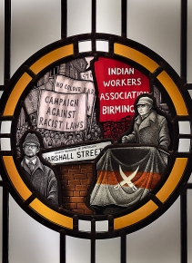
The Red Lion is a ‘desi’ pub owned by Indians, whose families originated in the Punjab, and came to work in the factories of Britain’s Black Country. Although all are welcome, the pub is mainly a socialising place for local people whose families came from the Subcontinent. It is one of several desi pubs in the former industrial heartland. In 2016, Steven Cartwright, who runs a studio that produces creative and decorative glassworks, was commissioned to create some stained-glass windows to decorate the Red Bull. His mission was to create traditional pub style stained-glass, but with an interesting slant – it was to celebrate the rich culture of the desi pub in the West Midlands. To do this, as Steven explained on his website (www.cartwrightglassdesigns.co.uk/projects/red-lion):
“I designed the window to give the appearance of a traditional pub but with a twist. The window utilises some of the colours and elements of the sub continent and tells the story of the punjabi community who migrated to the area in the 50’s. It also celebrates the establishment of the Indian workers association by Avtar Singh Jouhl and the visit of Malcolm X at their invitation.”
At the exhibition in Two Temple Place, there is a small piece of this pub’s stained-glass and some photographs of the rest of it.
What particularly intrigued me was the mention of The Indian Workers Association (‘IWA’) of Birmingham. The IWA was founded in the 1930s by Indian workers from Coventry to combat racist objections to them both by the British trade unions and the British people in general. The quote mentioned Avtar Singh Jouhl. He was born in the Punjab (British India) in 1937, and after the 1947 Partition, he came to London to study at the London School of Economics, arriving in 1958. Three years later, he moved to Smethwick in the Midlands, where he became an industrial worker. There, he saw and experienced racist anti-Indian conditions that prevailed at the time, He joined the IWA, and soon, along with others, he founded its Birmingham branch.
In February 1965, Jouhi invited the civil rights campaigner Malcolm X to visit Smethwick. A few days before his assassination, Malcolm X said of Smethwick:
“This is worse than America. This is worse than Harlem.”
In Jouhi’s obituary (The Guardian, 4th of November 2022), the following was written:
“The anti-racism campaign that attracted Malcolm X to Smethwick was spearheaded by Avtar Singh Jouhl, who has died aged 84 … Jouhl, as general secretary (1961-64; 1979-2015) and national organiser (1964-79) of the Indian Workers’ Association (IWA), challenged trade union members, factory owners and publicans to end this racism … When it came to breaking the colour bar in the town’s pubs, the IWA’s tactics were similar to those used by the Freedom Riders in the US in the previous decade. White university students were enlisted to order drinks, then hand them to British Indians, such as Jouhl. The landlord would invariably eject them, while the students challenged the eviction. The IWA then used evidence of these actions to successfully oppose the publican’s licence when it came up for renewal … This targeted campaign led to discrimination in pubs being outlawed in the Race Relations Act (1965) and paved the way for Britons of Indian heritage to become publicans themselves and set up what are commonly now known as “desi pubs”.
It was his actions described above and many others that helped to suppress racism in the Midlands and elsewhere in Britain. And it is very pleasing to see that what he achieved is being celebrated in glass in a pub owned and frequented by the people whom he helped. I visited the exhibition at Two Temple Place because I enjoy viewing glass artefacts. Little did I know that I would leave the exhibition having been introduced to an important political movement, about which I had known nothing.
THE EARLY WORKS OF artists, who became famous for their successful experimentation in style and expression (such as Matisse, Picasso, Van Gogh, Miro, and Hockney), began by making quite conventional figurative pictures – always competently executed. Such was also the case with the artist Philip Guston (1913-1980), who was born in Canada, son of Jewish parents who had migrated from Czarist Russia. Born ‘Goldstein’, he later changed his surname to ‘Guston’. His family moved to Los Angeles (USA) in 1922. His childhood was filled with trauma: his father committed suicide, and soon after that his brother was killed in a motor accident. He began to be involved with art as a way of dealing with these sad events. In the 1930s, he engaged with political activity, fighting racism and anti-Semitism at a time when the Ku Klux Klan was enjoying some prominence. Several of his paintings depict hoods, such as were worn by the Klan.
There is a retrospective exhibition of Guston’s works at London’s Tate Modern until the 25th of February 2024. The paintings are exhibited chronologically on the walls of eleven interconnecting display areas. Like the artists listed at the beginning of this piece, Guston’s early works are figurative and very beautifully painted. Many of these powerful images reflect his concerns about the adverse political developments he observed during the 1930s. Later, in the 1940s, he became friends with artists like Mark Rothko and Willem de Kooning, and he moved successfully from figurative painting to abstraction. He became well-known as an abstract artist. After that, in the 1960s, his art seemed to my eyes to go downhill.
Guston’s later works, which are partly figurative and partly abstract, and created in and after the late 1960s, were undoubtedly created to send messages to the viewer. However, I found them to be crudely executed in comparison with his earlier abstract and much earlier figurative works. Whether this crudeness was deliberate or reflected a decline in the artist’s ability I cannot say. These later works express the artist’s personal crises and his reaction to injustices and other global catastrophes, but they did not do much for me from an aesthetic point of view. Had I left the exhibition without seeing them, my admiration for Guston would have been higher than it is having seen them.