
MANY PEOPLE IN LONDON, including me until recently, me might never have heard of Edward Johnston (1872-1944), but almost everyone in the city, inhabitants and visitors, will have seen his work.
Johnston was a calligrapher. When Frank Pick became the Commercial Manage of The Underground Electric Railways Company of London in 1916, he commissioned Edward Johnston to design a font to be used as lettering on information panels, maps and signs on the Underground system. Its design was novel, quite different from the range of fonts in general use at that time.
Johnston’s easy to read font was so successful that it is still used on London’s Underground railway network.
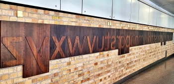
At Farringdon Station, there is a wall on which an art installation by Fraser Muggeridge has been placed. Created in 2017, it is a large-scale replica of a set of printing blocks for the entire alphabet in lower case letters. Made of wood, it is a very fitting memorial to Edward Johnston, who incidentally also designed the roundel logo that identifies London’s Transport system.
 yamey
yamey 